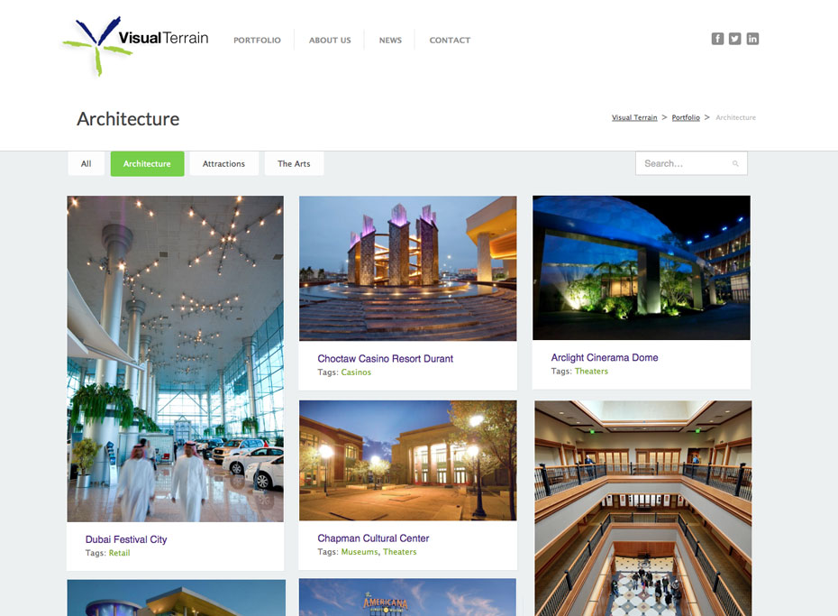
Visual Terrain was my first big client: a Lighting company in LA that specializes in Architecture, Attractions and the Arts, working all over the world to create lighting designs for corporate headquarters, huge retail projects, public art installations, museums, casinos and live shows. Their portfolio was extensive and the first go-around of the website in 2010 was focused on organizing and presenting their offerings in an intuitive and accessible way.
This year they returned to fine-tune and update the site.
We achieved a whole new look and feel by making the portfolio big and bold and adding not only categories of their various productions, but also special portfolio tags that allows the visitor to search and group projects by other characteristics. The portfolio is presented in a Masonry order, where each column has a defined width, but within that images of different heights align themselves like bricks in a wall without a gap. Each portfolio image has a title and tag, so that even in the overview page the visitor can search for other items that are similar.
The news section was re-engineered to be featured more prominently and the Team page shows off a jquery-powered quicklink from images to bios of the principals and crew.

