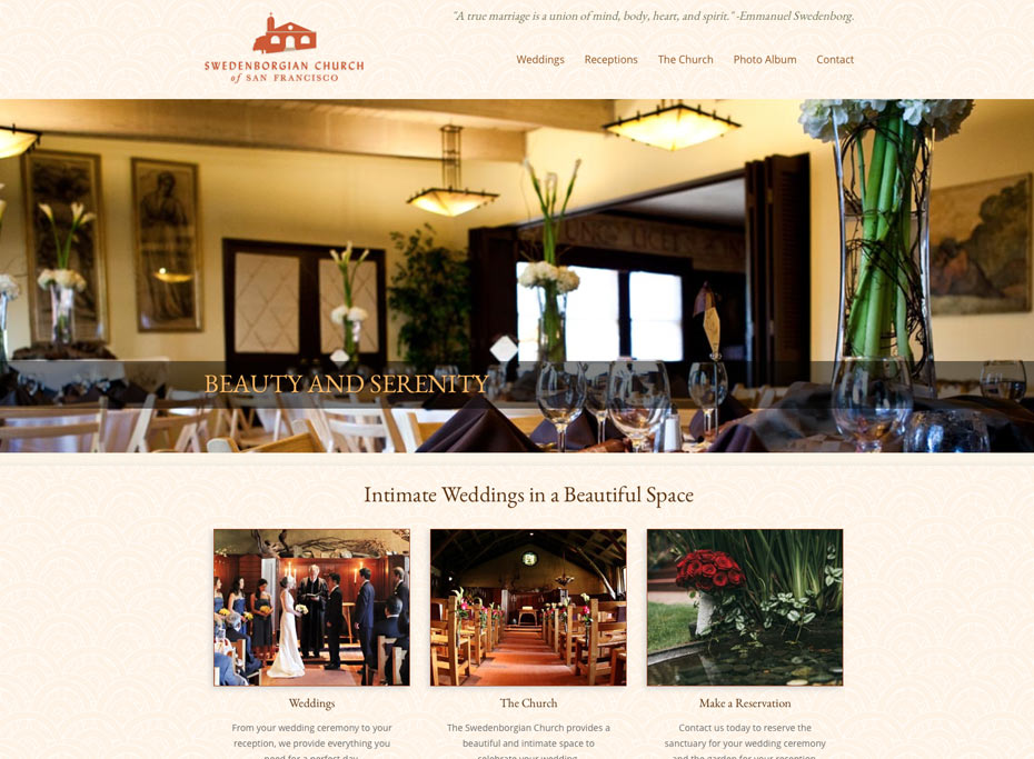
The Swedenborgian Church of San Francisco requested a website make-over to show off the features of their church and grounds as a perfect wedding location in their best light.
Together we decided to focus on images of the beautiful historic building, create an easy-to use navigation and highlight the important pages to visit on the homepage.
I constructed a site featuring a full-width slider on the homepage as well a three featured pages that lead to the most requested pages. The overall look of the site takes its cue from the Arts and Crafts design of the Swedenborgian church itself: a color scheme of earth tones and greens, along with a simple yet solid layout. A subtle “art-nouveau” background texture enhances the period feel of the site.
Careful attention was paid to the selection of fonts. I chose the classic EB Garamond for titles, so complement the traditional feel of the church and the clean and modern Open Sans as a body font, to make reading easy and the overall look balanced.

